Look at the chart comparing the price of graphic T-
shirts to the quantity supplied.
This cha...

Biology, 21.06.2021 16:30 payshencec21
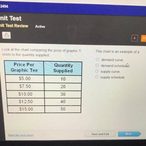
Look at the chart comparing the price of graphic T-
shirts to the quantity supplied.
This chart is an example of a
O demand curve.
O demand schedule.
Price Per
Graphic Tee
Quantity
Supplied
O supply curve
O supply schedule.
$5.00
10
$7.50
20
$10.00
30
$12.50
40
$15.00
50

Answers: 3


Another question on Biology
Biology, 22.06.2019 03:00
Johnny rode his bike to a friend's house 4 blocks down the street in his neighborhood. he immediately rode back home once he realized his friend was not able to play. what was his displacement for the total bike ride? how did you determine this? what could we use as a reference point to determine he was in motion during his bike ride? why can you use it as a reference point
Answers: 1
Biology, 22.06.2019 08:10
Match the functions to the cell types ? contraction and relaxation. conducting electrochemical signals fighting diseases carrying genetic material
Answers: 1
Biology, 22.06.2019 14:50
Which statements best describe the atoms of the gas neon? check all that apply
Answers: 3
Biology, 22.06.2019 16:20
Which example best describes a reflex action? a. eating food when hungry b. coughing when the throat is irritated c. bending down to lift a heavy object d. going for a walk outside
Answers: 2
You know the right answer?
Questions


Chemistry, 01.04.2020 01:37
Mathematics, 01.04.2020 01:37
Mathematics, 01.04.2020 01:37

History, 01.04.2020 01:37

Social Studies, 01.04.2020 01:37
Mathematics, 01.04.2020 01:37
Mathematics, 01.04.2020 01:37

Mathematics, 01.04.2020 01:37
History, 01.04.2020 01:37

Arts, 01.04.2020 01:37
History, 01.04.2020 01:37
Biology, 01.04.2020 01:37


