
Brainliest for the correct answer and 5 full stars
eric plotted the graph below to show the re...

Mathematics, 23.09.2019 06:00 jnannsbwnw4216
Brainliest for the correct answer and 5 full stars
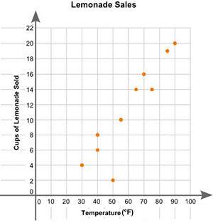
eric plotted the graph below to show the relationship between the temperature of his city and the number of cups of lemonade he sold daily:
a scatter plot is shown with the title lemonade sales. the x-axis is labeled high temperature, and the y-axis is labeled cups of lemonade sold. data points are located at 30 and 4, 40 and 6, 40 and 8, 50 and 2, 55 and 10, 65 and 14, 70 and 16, 75 and 14, 85 and 19, 90 and 20.
part a: describe the relationship between the temperature of the city and the number of cups of lemonade sold.
part b: describe how you can make the line of best fit. write the approximate slope and y-intercept of the line of best fit. show your work, including the points that you use to calculate the slope and y-intercept.

Answers: 2


Another question on Mathematics
Mathematics, 21.06.2019 15:10
Julia chooses a card at random from her set of cards. what is the probability that the card is labeled cat or hamster?
Answers: 2
Mathematics, 21.06.2019 17:00
Find the measure of the interior angles of the following regular polygons: a triangle, a quadrilateral, a pentagon, an octagon, a decagon, a 30-gon, a 50-gon, and a 100-gon.
Answers: 2
Mathematics, 21.06.2019 18:00
10 ! a train starts from grand city and travels toward belleville 388 miles away. at the same time, a train starts from belleville and runs at the rate of 47 miles per hour toward grand city. they pass each other 4 hours later. find the rate of the train from grand city.
Answers: 1
You know the right answer?
Questions

Advanced Placement (AP), 24.04.2020 09:24
Mathematics, 24.04.2020 09:24

Mathematics, 24.04.2020 09:24


Mathematics, 24.04.2020 09:24


Chemistry, 24.04.2020 09:24
Mathematics, 24.04.2020 09:24
Mathematics, 24.04.2020 09:24
Mathematics, 24.04.2020 09:24
Mathematics, 24.04.2020 09:24
Mathematics, 24.04.2020 09:24


