
Mathematics, 26.01.2020 06:31 nofer
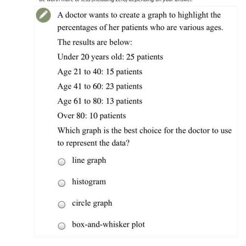
Adoctor wants to create a graph to highlight the percentages of her patients who are various ages.
the results are below:
under 20years old: 25patients
age 21 to 40: 15patients
age 41 to 60: 23patients
age 61 to 80: 13patients
over 80: 10 patients
which graph is the best choice for the doctor to use to represent the data?
a. line graph
b. histogram
c. circle graph
d. box-and-whisker plot

Answers: 3


Another question on Mathematics
Mathematics, 21.06.2019 20:00
It is given that the quadratic equation hx²-3x+k=0, where h and k are constants, has roots [tex] \beta \: and \: 2 \beta [/tex]express h in terms of k
Answers: 2
Mathematics, 21.06.2019 23:00
Of the 304 people who attended a school play, 5/8 were students. how many of the people who attended were students.
Answers: 1
Mathematics, 21.06.2019 23:20
Question 4 of 102 pointsjuliana had $96, which is eight times as much money as al had. how mucmoney did al have? select the correct solution method below, representingals money with x.
Answers: 2
You know the right answer?
Adoctor wants to create a graph to highlight the percentages of her patients who are various ages.
Questions


World Languages, 17.10.2019 20:30

Computers and Technology, 17.10.2019 20:30


History, 17.10.2019 20:30
Biology, 17.10.2019 20:30

Chemistry, 17.10.2019 20:30

Geography, 17.10.2019 20:30

Physics, 17.10.2019 20:30
History, 17.10.2019 20:30
Physics, 17.10.2019 20:30
Mathematics, 17.10.2019 20:30
Mathematics, 17.10.2019 20:30
Health, 17.10.2019 20:30


