Mathematics, 07.09.2020 02:01 kekoanabor19
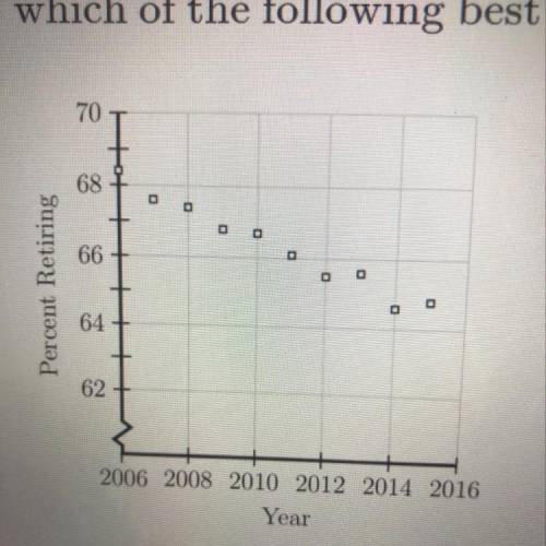
The scatterplot shown below represents data for each of the years from 2006
to 2015. The plot shows the percent of people 62 years of age and older who
were working and then retired during each of those years. If this trend continued.
which of the following best predicts the percent who retired in 2016 ?

Answers: 1


Another question on Mathematics
Mathematics, 21.06.2019 14:30
Paint color preference children adults total 0.6 0.77 liked new paint color disliked new paint color 0.4 0.15 0.23 total 1.0 1.0 1.0 which value for x completes the conditional relative frequency table by column?
Answers: 2
Mathematics, 21.06.2019 20:30
The difference between two numbers is one. three times the larger number minus two times the smaller number is 9. what are the two numbers
Answers: 3
Mathematics, 21.06.2019 22:00
The sum of the speeds of two trains is 720.2 mph. if the speed of the first train is 7.8 mph faster than the second train, find the speeds of each.
Answers: 1
Mathematics, 21.06.2019 23:00
Why is it so easy to buy on impulse and overspend with a credit card? what could you do to counteract this tendency?
Answers: 1
You know the right answer?
The scatterplot shown below represents data for each of the years from 2006
to 2015. The plot shows...
Questions


English, 03.05.2021 20:10


Arts, 03.05.2021 20:10
Mathematics, 03.05.2021 20:10