
Mathematics, 12.01.2021 20:10 emocow
1)
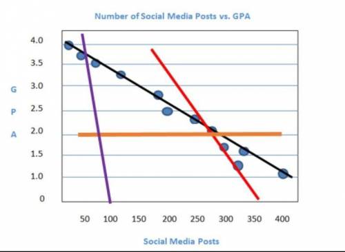
The scatterplot shows the relationship between the number of texts a student sends each week and the student's GPA. Which color is the line of best fit for the data points?
A) red
B) purple
C) black
D) orange
2)
Which should you consider when informally assessing whether a line is the best fit for the data on a scatter plot?
A) the range of the data points
B) the median of the data points
C) the outliers of the data points
D) the closeness of the data points

Answers: 1


Another question on Mathematics
Mathematics, 21.06.2019 15:30
The triangles are similar. what is the value of x? show your work.
Answers: 1
Mathematics, 21.06.2019 21:20
Find the distance from the theater to the library. leave your answer in simplest radical form if necessary. 12 √12 74 √74
Answers: 2
Mathematics, 21.06.2019 21:30
How do your peer relationships affect your overall health status? what can you do to improve your peer relationships?
Answers: 1
You know the right answer?
1)
The scatterplot shows the relationship between the number of texts a student sends each week and...
Questions

Biology, 14.07.2019 15:00

Computers and Technology, 14.07.2019 15:00
Mathematics, 14.07.2019 15:00

Mathematics, 14.07.2019 15:00

History, 14.07.2019 15:00
History, 14.07.2019 15:00

Mathematics, 14.07.2019 15:00

Social Studies, 14.07.2019 15:00


