
Mathematics, 14.01.2021 09:30 autumnsusan190ox9kn4
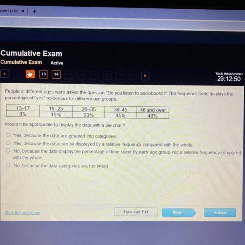
People of different ages were asked the question "Do you listen to audiobooks?" The frequency table displays the
percentage of "yes" responses for different age groups
13-17
8%
18-25
15%
26-35
23%
36-45
45%
46 and over
48%
Would it be appropriate to display the data with a pie chart?
O Yes, because the data are grouped into categories
O Yes, because the data can be displayed by a relative frequency compared with the whole
O No, because the data display the percentage of time spent by each age group, not a relative frequency compared
with the whole
O No, because the data categories are too broad
Save and Exit
Next
Submit
art this and rem

Answers: 2


Another question on Mathematics
Mathematics, 21.06.2019 17:00
Sole with work in 10 years, the average number of hours of tv watched per week by teenagers dropped from 23.9 to 21.4. find the percent of change.
Answers: 1
Mathematics, 21.06.2019 20:00
If the simple annual interest rate on a loan is 6, what is the interest rate in percentage per month?
Answers: 1
You know the right answer?
People of different ages were asked the question "Do you listen to audiobooks?" The frequency table...
Questions
Mathematics, 24.10.2019 17:43

Geography, 24.10.2019 17:43

Computers and Technology, 24.10.2019 17:43
Mathematics, 24.10.2019 17:43
Mathematics, 24.10.2019 17:43


History, 24.10.2019 17:43


Physics, 24.10.2019 17:43

Biology, 24.10.2019 17:43


