
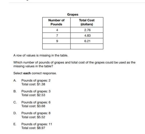
Mathematics, 14.02.2021 08:20 ecarter8967
The bar graph below displays students' responses to
the question "What caffeinated drinks do you
consume?"
Would it be appropriate to display the data with a pie
chart?
Caffeinated Drinks
Yes, because the data are grouped into categories.
Yes, because the data can be represented by a
relative frequency compared to the whole.
No, because the data add up to more than 100%.
No, because the data categories are too broad.
0.9
0.6
Relative Frequency
0.3
0.0
Coffee
Energy
Tea Soda
Drink

Answers: 3


Another question on Mathematics
Mathematics, 21.06.2019 19:30
Solve the equation for x.3(6x - 1) = 12 i've tried doing the math and i can't find out what i'm doing wrong
Answers: 1
Mathematics, 21.06.2019 20:00
The distribution of the amount of money spent by students for textbooks in a semester is approximately normal in shape with a mean of $235 and a standard deviation of $20. according to the standard deviation rule, how much did almost all (99.7%) of the students spend on textbooks in a semester?
Answers: 2
Mathematics, 21.06.2019 21:00
Simplify. 4+3/7x-2-2/7x a. 2-5/7x b. 6-1/7x c. 2+1/7x d. 6+5/7x
Answers: 1
You know the right answer?
The bar graph below displays students' responses to
the question "What caffeinated drinks do you
Questions

Geography, 28.11.2019 14:31

Mathematics, 28.11.2019 14:31

Biology, 28.11.2019 14:31

Physics, 28.11.2019 14:31


History, 28.11.2019 14:31

Chemistry, 28.11.2019 14:31

Business, 28.11.2019 14:31
History, 28.11.2019 14:31


Spanish, 28.11.2019 14:31


