Mathematics, 18.02.2021 19:10 lolsmaster3951
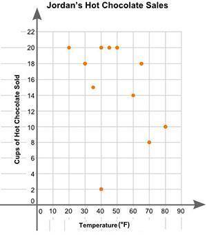
Will give brainliest to the correct answer Jordan plotted the graph below to show the relationship between the temperature of his city and the number of cups of hot chocolate he sold daily: A scatter plot is shown with the title Jordans Hot Chocolate Sales. The x axis is labeled High Temperature and the y axis is labeled Cups of Hot Chocolate Sold. Data points are located at 20 and 20, 30 and 18, 40 and 20, 35 and 15, 50 and 20, 45 and 20, 60 and 14, 65 and 18, 80 and 10, 70 and 8, 40 and 2. Part A: In your own words, describe the relationship between the temperature of the city and the number of cups of hot chocolate sold. (2 points) Part B: Describe how you can make the line of best fit. Write the approximate slope and y-intercept of the line of best fit. Show your work, including the points that you use to calculate the slope and y-intercept. (3 points)

Answers: 2


Another question on Mathematics
Mathematics, 20.06.2019 18:04
Brian has an unlimited number of cents (pennies), nickels, and dimes. in how many different ways can he pay 1414cents¢ for a chocolate mint?
Answers: 3
Mathematics, 21.06.2019 16:00
Kathleen's gross annual salary is $56,820. what is the maximum amount of rent she can afford to pay? round your answer to the nearest dollar. question 1 options: $1146 $1326 $1656 $2368
Answers: 3
Mathematics, 21.06.2019 18:50
Jermaine has t subway tokens. karen has 4 more subway tokens than jermaine. raul has 5 fewer subway tokens than jermaine. which expression represents the ratio of karen's tokens to raul's tokens
Answers: 1
You know the right answer?
Will give brainliest to the correct answer
Jordan plotted the graph below to show the relationship...
Questions
Mathematics, 05.11.2020 01:00


Health, 05.11.2020 01:00
English, 05.11.2020 01:00
Mathematics, 05.11.2020 01:00
English, 05.11.2020 01:00
Health, 05.11.2020 01:00

Computers and Technology, 05.11.2020 01:00

Mathematics, 05.11.2020 01:00