
Mathematics, 11.03.2021 14:00 alliuhhh0
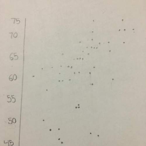
Jack plotted the graph below to show the relationship between the temperature of his city and the number of ice cream cones he sold daily: Main title on graph is Ice Cream Cone Sale. Graph shows 0 to 30 on x axis at increments of 5 and 0 to 60 on y axis at increments of 10. The label on the x axis is Temperature in degree C, and the label on the y axis is Number of Ice Cream Cones Sold. Dots are made at the ordered pairs 0, 5 and 5, 15 and 7.5, 15 and 10, 24 and 10, 28 and 12, 32 and 12.5, 25 and 12.5, 30 and 15, 35 and 15, 40 and 17.5, 35 and 20, 45 and 22.5, 36 and 23, 46 and 25, 55 and 27.5, 60. Part A: In your own words, describe the relationship between the temperature of the city and the number of ice cream cones sold. (5 points) Part B: Describe how you can make the line of best fit. Write the approximate slope and y-intercept of the line of best fit. Show your work, including the points that you use to calculate slope and y-intercept.

Answers: 3


Another question on Mathematics
Mathematics, 21.06.2019 18:00
State if the two triangles are congruent. if they are, state how you know?
Answers: 1
Mathematics, 21.06.2019 18:30
Can someone me do math because i am having a breakdown rn because i don’t get it
Answers: 1
Mathematics, 21.06.2019 19:30
Solve for x and y: 217x + 131y = 913; 131x + 217y = 827
Answers: 1
Mathematics, 21.06.2019 20:30
Asunflower was 20 1/2 inches tall. over the next 6 months, it grew to a height of 37 inches tall. what was the average yearly growth rate of the height of the plzzz write a proportion i will give you 100 points
Answers: 1
You know the right answer?
Jack plotted the graph below to show the relationship between the temperature of his city and the nu...
Questions

Chemistry, 07.09.2021 22:20

History, 07.09.2021 22:20
Mathematics, 07.09.2021 22:20

Geography, 07.09.2021 22:20


Social Studies, 07.09.2021 22:20


Mathematics, 07.09.2021 22:30
Mathematics, 07.09.2021 22:30
Social Studies, 07.09.2021 22:30


