
Mathematics, 01.04.2021 16:20 11232003
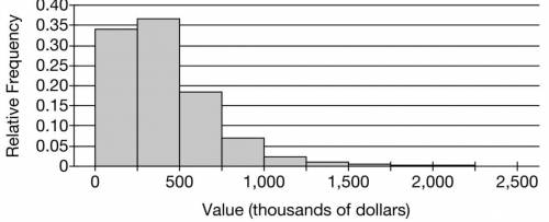
The following histogram shows the distribution of house values in a certain city. The mean of the distribution is $403,000 and the standard deviation is $278,000.
The figure represents a histogram. The horizontal axis is labeled “Value, in thousands of dollars,” and is numbered 0 through 2,500, in increments of 500. The vertical axis is labeled “Relative Frequency,” and is numbered 0 through 0.40, in increments of 0.05. The data presented in the graph are as follows, note that the values are approximate. 0 to 250 thousands of dollars, 0.34 relative frequency. 250 to 500 thousands of dollars, 0.36 relative frequency. 500 to 750 thousands of dollars, 0.18 relative frequency. 750 to 1,000 thousands of dollars, 0.07 relative frequency. 1,000 to 1,250 thousands of dollars, 0.025 relative frequency. 1,250 to 1,500 thousands of dollars, 0.01. 1,500 to 1,750 thousands of dollars, 0.005 relative frequency. 1,750 to 2,000 thousands of dollars, 0.003 relative frequency. 2,000 to 2,250 thousands of dollars, 0.003 relative frequency. 2,250 to 2,500 thousands of dollars, 0 relative frequency.
(a) Suppose one house from the city will be selected at random. Use the histogram to estimate the probability that the selected house is valued at less than $500,000. Show your work.
▲
0 / 10000 Word Limit0 words written of 10000 allowed
Question 2
(b) Suppose a random sample of 40 houses are selected from the city. Estimate the probability that the mean value of the 40 houses is less than $500,000. Show your work.
0 / 10000 Word Limit
Question 3
To estimate a population mean μ, the sample mean x¯ is often used as an estimator. However, a different estimator is called the sample midrange, given by the formula sample minimum + sample maximum2.
(c) The following table shows the values, in thousands of dollars, of 40 randomly selected houses in the city.
34 38 95 110 137 140 155 155 169 207
209 217 274 314 314 323 343 347 349 363
369 373 388 389 397 416 448 450 483 487
488 516 571 595 600 738 762 769 863 1,084
(i) Calculate the sample midrange for the data.
(ii) Explain why the sample midrange might be preferred to the sample mean as an estimator of the population mean.
0 / 10000 Word Limit
Question 4
(d) To investigate the sampling distribution of the sample midrange, a simulation is performed in which 100 random samples of size n=40 were selected from the population of house values. For each sample, the sample midrange was calculated and recorded on the following dotplot. The mean of the distribution of sample midranges is $617,000 with standard deviation $136,000.
The figure presents a dotplot where the horizontal axis is labeled “Sample Midrange, in thousands of dollars,” and is numbered 400 through 1,100, in increments of 100. The majority of the data on the graph is between 390 and 730 thousands of dollars with smaller amounts from 750 to 840 thousands of dollars and 3 outliers, one at 940, one at 960, and one at 1,060 thousands of dollars. The data presented are as follows, note that all values are approximate. 1 dot above 390. 2 dots above 410. 2 dots above 420. 5 dots above 430. 1 dot above 440. 2 dots above 450. 1 dot above 460. 3 dots above 470. 3 dots above 480. 2 dots above 490. 1 dot above 510. 2 dots above 520. 2 dots above 530. 6 dots above 540. 3 dots above 550. 2 dots above 560. 5 dots above 570. 4 dots above 580. 1 dot above 590. 1 dot above 600. 2 dots above 610. 4 dots above 620. 4 dots above 630. 2 dots above 640. 5 dots above 650. 1 dot above 670. 2 dots above 680. 3 dots above 690. 4 dots above 700. 3 dots above 710. 2 dots above 720. 1 dot above 730. 1 dot above 750. 1 dot above 760. 3 dots above 770. 1 dot above 790. 3 dots above 800. 1 dot above 810. 1 dot above 820. 1 dot above 830. 3 dots above 840. 1 dot above 940. 1 dot above 960. 1 dot above 1,060.
Based on the results of the simulation, explain why the sample mean might be preferred to the sample midrange as an estimator of the population mean.

Answers: 2


Another question on Mathematics
Mathematics, 21.06.2019 18:30
The table shows the relationship between the number of cups of cereal and the number of cups of raisins in a cereal bar recipe: number of cups of cereal number of cups of raisins 8 2 12 3 16 4 molly plotted an equivalent ratio as shown on the grid below: a graph is shown. the title of the graph is cereal bars. the horizontal axis label is cereal in cups. the x-axis values are 0, 20, 40, 60, 80,100. the vertical axis label is raisins in cups. the y-axis values are 0, 10, 20, 30, 40, 50. a point is plotted on the ordered pair 40,20. which of these explains why the point molly plotted is incorrect? (a) if the number of cups of cereal is 40, then the number of cups of raisins will be10. (b)if the number of cups of raisins is 40, then the number of cups of cereal will be10. (c) if the number of cups of cereal is 40, then the number of cups of raisins will be 80. (d) if the number of cups of raisins is 40, then the number of cups of cereal will be 80.
Answers: 1
Mathematics, 21.06.2019 18:30
Deshawn uses 3/4 of a box of rice to cook dinner the portion he uses weighs 12 ounces right and solve an equation to find the weight of the full box of rice
Answers: 1
Mathematics, 21.06.2019 22:00
Luke wants to reduce the area of his rectangular garden by 1/4 the expression 14/w can be used to represent this change. what is another way to write this expression?
Answers: 1
Mathematics, 21.06.2019 22:50
Which best explains why this triangle is or is not a right triangle ?
Answers: 2
You know the right answer?
The following histogram shows the distribution of house values in a certain city. The mean of the di...
Questions
Mathematics, 01.06.2021 01:10

Chemistry, 01.06.2021 01:10


Social Studies, 01.06.2021 01:10

Health, 01.06.2021 01:10
English, 01.06.2021 01:10
Mathematics, 01.06.2021 01:10
Mathematics, 01.06.2021 01:10
Mathematics, 01.06.2021 01:10
Mathematics, 01.06.2021 01:10
Mathematics, 01.06.2021 01:10


