
Mathematics, 06.05.2021 21:40 silviamgarcia
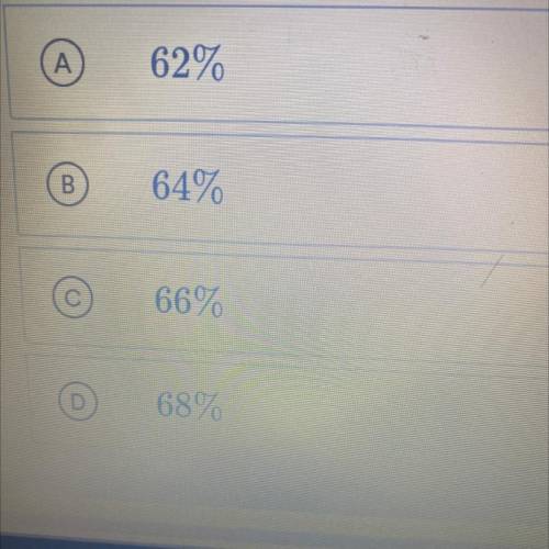
The scatterplot shown below represents data for each of the years from 2006 to 2015. The plot shows the percent of people 62 years of age and older who we’re working and then retired during each of those years. If this trend continued which of the following best predicts the percent who retired in 2016?

Answers: 1


Another question on Mathematics
Mathematics, 21.06.2019 14:50
What is the square root of 45? (step by step working plz)
Answers: 1
Mathematics, 21.06.2019 23:00
40 points. given: two congruent angles ∠c and ∠r are supplementary. prove: ∠r and ∠c are both right angles. it doesn't have to be exactly 10 rows.statements reasons1. 1. 2. 2. 3. 3. 4. 4. 5. 5. 6. 6. 7. 7. 8. 8. 9. 9. 10. 10.
Answers: 2
Mathematics, 21.06.2019 23:30
Drag each equation to the correct location on the table. for each equation, determine the number of solutions and place on the appropriate field in the table.
Answers: 3
Mathematics, 22.06.2019 00:30
Nicole purchased a container of cashews that weighs 5 kilograms. zion purchased a container of cashews that weighs 4,900 grams. how many more grams of cashews did nicole purchase?
Answers: 1
You know the right answer?
The scatterplot shown below represents data for each of the years from 2006
to 2015. The plot sho...
Questions


Computers and Technology, 05.09.2019 04:20
Computers and Technology, 05.09.2019 04:20


Social Studies, 05.09.2019 04:20


