
Mathematics, 20.01.2020 01:31 tay8568
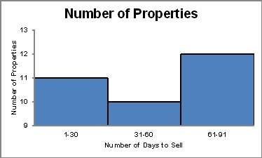
The histogram below shows the number of properties in a town that sold within certain time periods.
why might the graph be considered misleading?
the scales on the x- and y-axes are unequal.
the interval on the x-axis is too large for the data set.
the scale on the y-axis misrepresents the difference in the heights of the bars.
the interval on the y-axis is too large for the data set.

Answers: 3


Another question on Mathematics
Mathematics, 22.06.2019 01:00
First work with stencil one. use a combination of reflections, rotations, and translations to see whether stencil one will overlap with the original pattern. list the sequence of rigid transformations you used in your attempt, noting the type of transformation, the direction, the coordinates, and the displacement in
Answers: 3
Mathematics, 22.06.2019 02:40
Factor the following polynomial completely 514 + 2013 - 1052 oa. 5121 + 3)( - ) ob. 51%(1 - 3)(1 + 7) oc. 5198 - 3)(x + 7) od 51%(+ 3)(x - 7)
Answers: 1
Mathematics, 22.06.2019 04:00
The length of a rectangle is 2 inches more than twice it’s width. if the perimeter of the rectangle is 70 inches,find it’s length and width
Answers: 1
Mathematics, 22.06.2019 06:30
How do the graphs of the functions f(x) = (1.5)x and g(x) = (0.66)x compare?
Answers: 1
You know the right answer?
The histogram below shows the number of properties in a town that sold within certain time periods....
Questions

History, 12.11.2019 00:31
History, 12.11.2019 00:31

Mathematics, 12.11.2019 00:31

Mathematics, 12.11.2019 00:31
Chemistry, 12.11.2019 00:31
Mathematics, 12.11.2019 00:31
History, 12.11.2019 00:31
History, 12.11.2019 00:31


