
Social Studies, 01.11.2020 20:40 2021ehays
Analyze the chart below and answer the question that follows.
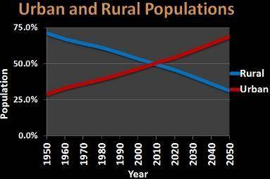
A line graph of Urban and Rural Population. The x-axis is labeled Year from 1950 to 2050 by decade. The y-axis is labeled Population from 0 to 75 percent by 25 percent. The red line is labeled Urban and the blue line is labeled Rural. Rural goes from 75 percent to almost 25 percent. Urban goes from 25 percent to 75 percent.
Data courtesy of the UN
According to the chart above, what is happening to the world’s urban and rural populations? Explain what the chart helps us to understand. Your response should use at least two to three sentences.

Answers: 3


Another question on Social Studies
Social Studies, 22.06.2019 14:30
The process of rocks breaking down and becoming other rocks
Answers: 2
Social Studies, 23.06.2019 01:30
One result of recent migration trends is that the workforce in europe has become
Answers: 3
Social Studies, 23.06.2019 18:00
During the age of imperialism, the economies of european colonies a) were commercially independent from the europe. b) experienced rapid and complete industrialization. c) eventually became dependent on the european global market. eliminate d) were seen as testing grounds for new and risky technology
Answers: 1
Social Studies, 23.06.2019 19:20
Do you think there should be more than two parties in the us political system, or does the us system work well?
Answers: 1
You know the right answer?
Analyze the chart below and answer the question that follows.
A line graph of Urban and Rural Popul...
Questions

Engineering, 27.04.2020 02:26
Mathematics, 27.04.2020 02:26
Mathematics, 27.04.2020 02:26

Mathematics, 27.04.2020 02:26
Mathematics, 27.04.2020 02:26

Health, 27.04.2020 02:26

Arts, 27.04.2020 02:26
Mathematics, 27.04.2020 02:26

Physics, 27.04.2020 02:26


English, 27.04.2020 02:26


